Today I shipped a blog blob.
Having fun
For a while, I’ve been meaning to work on something fun for my website when I ran across this tutorial. I have always admired the work that Josh puts in to make his website fun. I think this is a piece of the web we lost over time but is regaining popularity. More on that another day. I love following code tutorials for fun little projects like these. Back in the day, I followed a D3 JS tutorial to build a small snippet. You can view that codepen here. More on this another day too. Back to the article I was following - what a beautifully written piece! It’s written at the exact amount of detail for me. Not too much, not too little.
Random vs pseudo-random
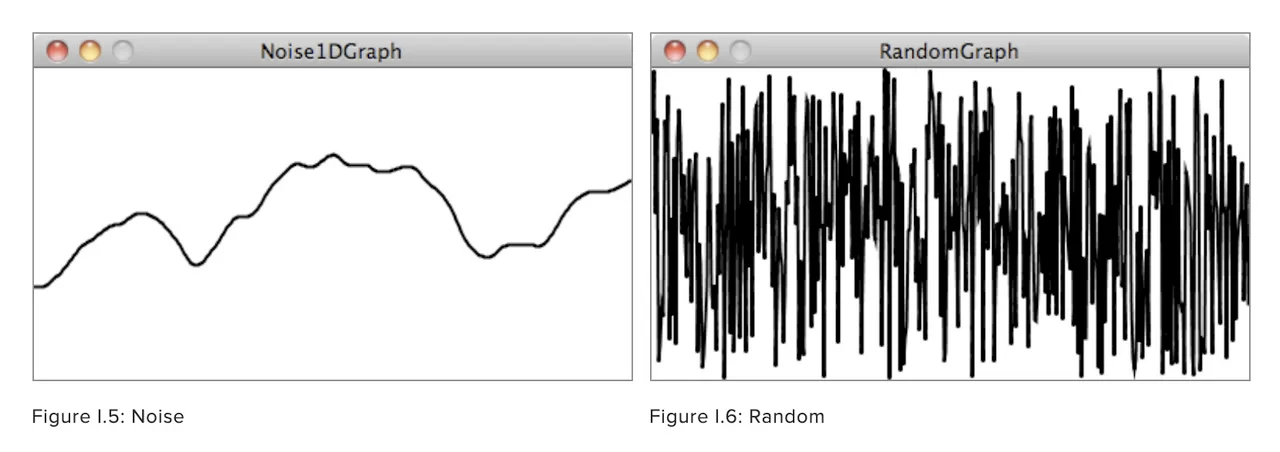
The graph about the difference between generating random numbers from a computer and generating pseudo-random noise was very eye opening. You want to smoothly transition from one point to another in the graph rather than jump all over the place, what you are looking for is noise, not random. I guess it’s still random but over a subset rather than the entire boundary.

This image is originally from the book The nature of Code but I originally found it on George Francis’s website.
Subtle tweaks
I followed the tutorial but added some small tweaks to make it a little more personal
- I changed the hover effect to a click effect, so the blob animates “harder” on click
- Remove page background animation because in some cases where navigation occurred internally, Gatsby would perform client-side navigation. In those cases, the page background remained on whatever color was seen last on the animation even if the user navigated to a blog page and that affected readability.
- Also, just for fun, tweaked the hue angle and changed the number of points
- I also peppered in a React hook to detect if the user prefers reduced motion to make it more accessible. I later realized that other tutorials of his come with this baked-in.
Other than that, it’s fairly straightforward based on the tutorial.
60 degree hue rotation
The article also points to a tip from twitter that helps generate soothing gradient palettes. The trick is to rotate hue by 60 degrees from your starting point to find a correlated color that you can use as another stop on the gradient.
Future work
All in all, I am really happy with this and you can see the effect by navigating to my 404 page. Hopefully, it’s something you don’t come across often 😉. When working on this, my focus really gravitated towards the accessible aspects of my website. There’s some animation in there that doesn’t respect user preferences. I’d like to address those but also work on accessibility of my personal website in general. I am working off of this tutorial to build an accessible tab interface. I highly recommend the entire Inclusive components series of articles. Similar to the one I mentioned in this post, it talks about tradeoffs and in just the right amount of detail.